 Kevin Smith
1 min read
How "The Fold" Has Evolved in Email Marketing
Marketing buzzwords come and go, but some stick around longer than others. One such term is ‘the fold’ in email marketing—that invisible line where...

If you ever wonder why your website isn't converting as well as you'd hoped, you're not alone. As a digital marketing agency, we've seen firsthand how a website's design can catapult sales or drag them down into the abyss.
The good news? Sometimes, it only takes a few small tweaks to make big improvements.
Let's dive into why your website design might be the culprit behind sluggish sales and, more importantly, how you can fix it.
Remember the last time you walked into a cluttered store, couldn't find what you were looking for, and walked right out? Paco Underhill, the author of "Why We Buy: The Science of Shopping," refers to this as the confusion index. It's why if you spend 10 minutes in a Target walking around in circles trying to find what you came in for, it feels like you've been there for 30 minutes or more.
That's exactly how visitors feel when encountering a website with a confusing layout, overwhelming navigation, slow load times, or a design that doesn't work well on mobile.
At Mighty Roar, we often talk about guiding the consumer towards the purchase. An example of this would be a website redesign we did for a hot tub brand. A hot tub is a BIG purchase that requires many considerations.
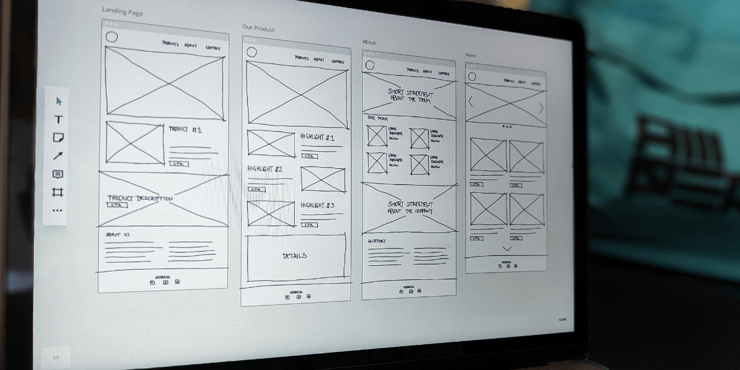
We worked with the client to redesign the user experience of the site to allow visitors to determine their starting point:
Simplifying the navigation and speeding things up resulted in an immediate uptick in sales. Lesson learned: don't make your prospects work to give you their business.
A website without clear CTAs is like a salesperson who doesn't ask for the sale.
We've audited countless websites where the CTA seemed to be playing its own game of hide and seek—either buried under content or so bland ("Learn more") that it was easily overlooked. Sprucing up those CTAs with some compelling text and color can be the difference between a bounce and a conversion.
There is also the factor of single-option aversion to consider. This is where consumers are reluctant to pick an option—even one they like—when no other options are offered.
An example of this would be someone looking to avoid a "hard sell" or someone still not confident that they've explored all their options. So, in addition to more compelling CTAs, consider secondary CTAs that allow prospects a different way into your sales funnel.
Striking the right content and design balance is key. Too much "stuff" including content, design elements, offers, etc. can quickly overwhelm visitors, while too little can make your site forgettable or seem "lesser" and unsophisticated.
One of our financial services clients had a homepage that was so busy it was dizzying. We redesigned their website to be more streamlined, focusing on their core message, limiting the color palette, and updating images and icons to have a cohesive look and feel. This led to an immediate improvement in engagement and an increase in time spent on the site.

Not ready for a redesign? Not a problem. We've also improved websites with a less extensive "design refresh." This can involve updating content. simplifying design and content clutter, making minor UX changes, or adding just enough visual interest to keep visitors engaged without overwhelming them.
Your website should help guide visitors through their consumer decision journey, with each element building upon the last.
A lack of visual hierarchy can leave visitors confused about where to look or go next. Think of it as trying to read a book without chapters or paragraph breaks—exhausting, right?

Visitors are not spending as much time as we may hope on our site, so you want to ensure that your design grabs attention, provides a scannable layout, and leads them along the path to purchase.
If Google can't find you, neither can your customers.
SEO isn't just about focusing on the right keywords; it's also about how your website is designed. For instance, heavy images can slow your site down, affecting your search rankings.
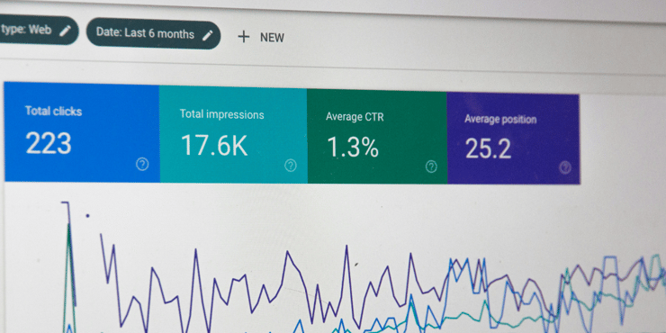
We've helped brands transform their online visibility simply by correcting technical issues within their site's design, leading to more traffic and, ultimately, higher sales.
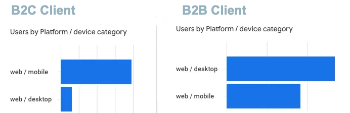
We've been saying it for a decade now, but it clearly still needs to be said: we live in a mobile world, and if your website doesn't perform well on phones and tablets, you're missing out on a massive chunk of the market.
Responsive design isn't a nice-to-have; it's a must. We've had clients that have seen their sales nearly double after switching to a mobile-friendly design.
Why? Because over half (or more!) of their traffic was coming from mobile devices, and before the switch, those mobile visitors didn't want to deal with broken pages and crazy-long application forms.
Remember, your website is often the first point of contact between your business and potential customers. Making sure it's designed to convert is incredibly important.
You can turn your website into a sales-generating machine by paying attention to user experience, ensuring your CTAs are clear and compelling, and keeping up with the latest SEO and mobile design best practices.
And don't be afraid to make changes and test new ideas. The most successful websites constantly evolve and optimize based on the data in front of them.

1 min read
Marketing buzzwords come and go, but some stick around longer than others. One such term is ‘the fold’ in email marketing—that invisible line where...

1 min read
The holiday season is a pivotal time for many businesses—a period relied upon to boost sales, engage with customers, and strengthen brand loyalty.

1 min read
Recently, we had an introduction call with a prospective client, and they asked us: "what is digital marketing, anyway?" It’s honestly not a question...