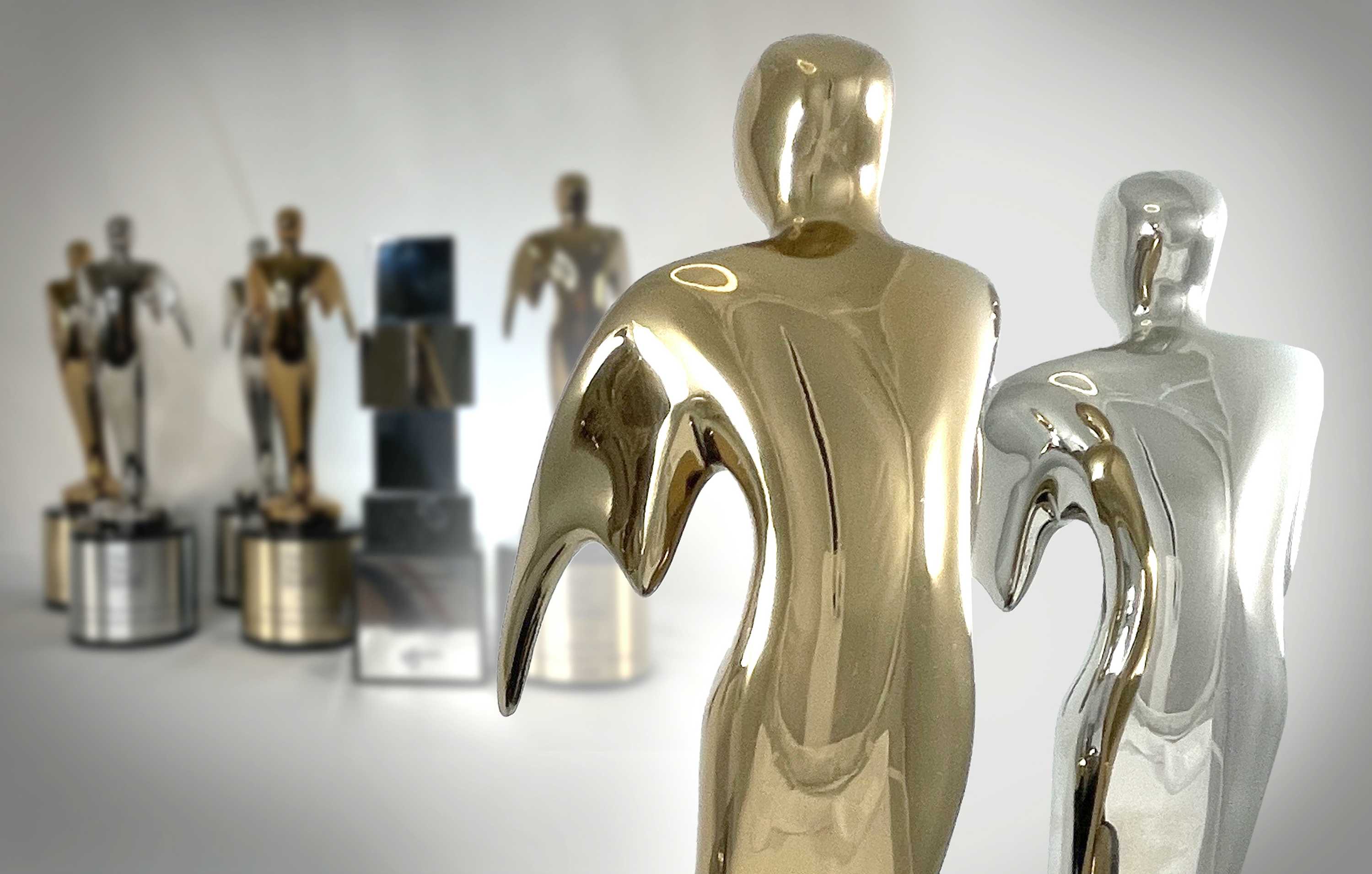
Mighty Roar Wins w3 Award, Telly, & Top 100 Marketing Agencies Ranking
As we close the books on a bizarre year, we're incredibly grateful for our fantastic team and clients that enabled our success – regardless of what...
.png)
Today we are proud to launch a new logo for Mighty Roar, and wanted to provide context as to why we decided to evolve the look and feel of our brand.

Our initial wordmark was simple and modern, but it was time for something that better highlighted our positioning and what we can bring to client relationships.
We applied the same brand identity process to ourselves as we do for our clients, including:
 The logo itself is bold, easy to read, and fulfills associations with our name.
Dynamic, wave-inspired lines represent how we amplify our clients' voices in a crowded space.
The orange "M" brings to mind the "M" of Mighty Roar, and the intertwined lines represent our symbiotic approach to strategy and creative. The resulting crown shape, formed by the lines, illustrates how we assist clients in coming out on top as victors, even against formidable competitors.
We decided to keep orange in our logo, as we felt it is still a strong part of our identity. Orange is hard to ignore and signifies energy, enthusiasm, creativity, and endurance. It’s also a color that stands out against our competitors. We adjusted the orange hue a bit and added a dark navy to our palette for a more grounded contrast. In addition, we incorporated a subtle gradient to the logo mark to help define the wave-inspired shape.
We are excited about the new Mighty Roar logo because we believe it captures the spirit of our partnerships with clients over the years—and how we will meet their needs into the future!
Sign up for our monthly newsletter to receive updates.

As we close the books on a bizarre year, we're incredibly grateful for our fantastic team and clients that enabled our success – regardless of what...

If you ever wonder why your website isn't converting as well as you'd hoped, you're not alone. As a digital marketing agency, we've seen firsthand...

In the course of running an advertising agency, we have so many great conversations with other agency owners, chief marketing officers, and marketing...